A Feature You Need
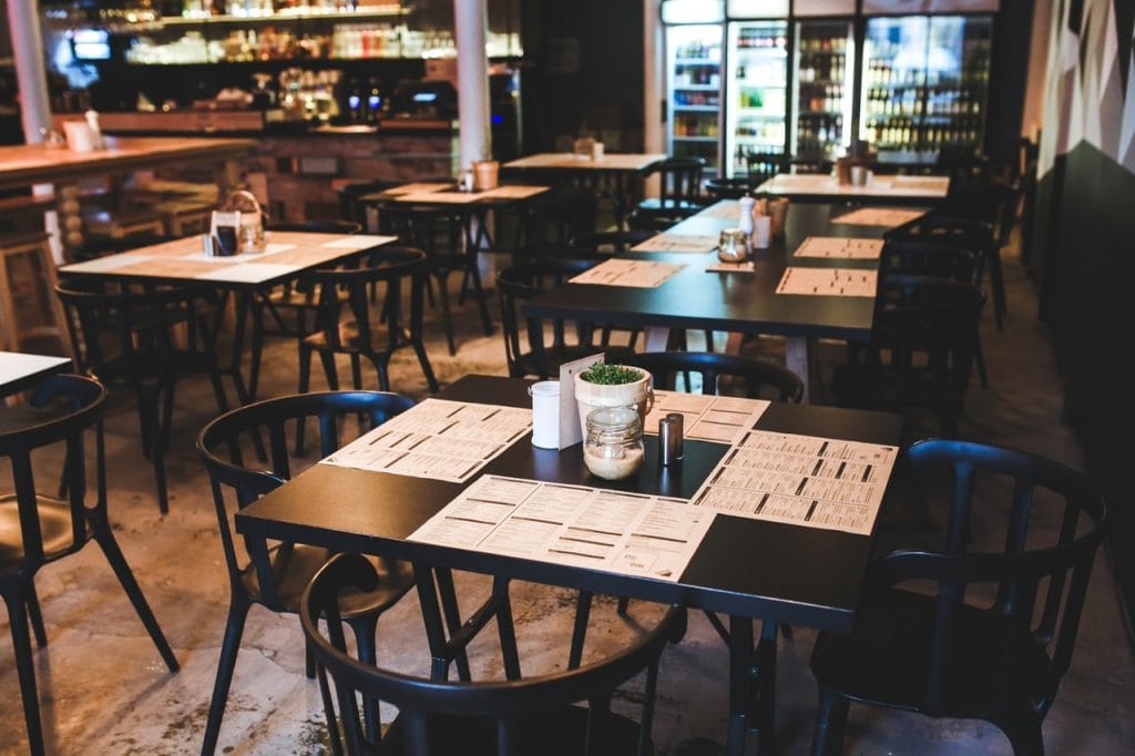
Table management is one of the important features that every successful restaurant needs. How else can you track your table turnover rate?
Do you track your customer’s order times and their time spent in the restaurant? Are they waiting for more than half an hour because of a miss-communication in the kitchen?
Often times, restaurants missed out on opportunities to serve faster and efficiently. This is because they do not closely monitor their table turnover rate.
In fact, you will be surprised at how much you can potentially gain from improving your table turnover rate, especially during peak hours.
By default, Slurp Point of Sale provides an intuitive dashboard that shows your tables by alphabetical order and their statuses at a glance.
This should get you pretty far in your regular day to day restaurant operations.
Table Layout Designer
However we also understand the need for some restaurants to show the tables in their restaurant layout manner. This is mainly to help their waiters to identify the position of each tables easily.
With our simple to use table layout manager in Slurp Central, it should not take long for you to design and get a layout up and running.
Simply tap on the lock button and enter the manager pin to edit the layout. After authentication, you will see two options, tables and areas.
Areas are identified by a circle sitting atop a floor tile, in this option you get (Add New Area, Add Visual Area, Add Text, Select Area Background Image and Remove Area). Areas could be indoors, outdoors or floors in your restaurant.
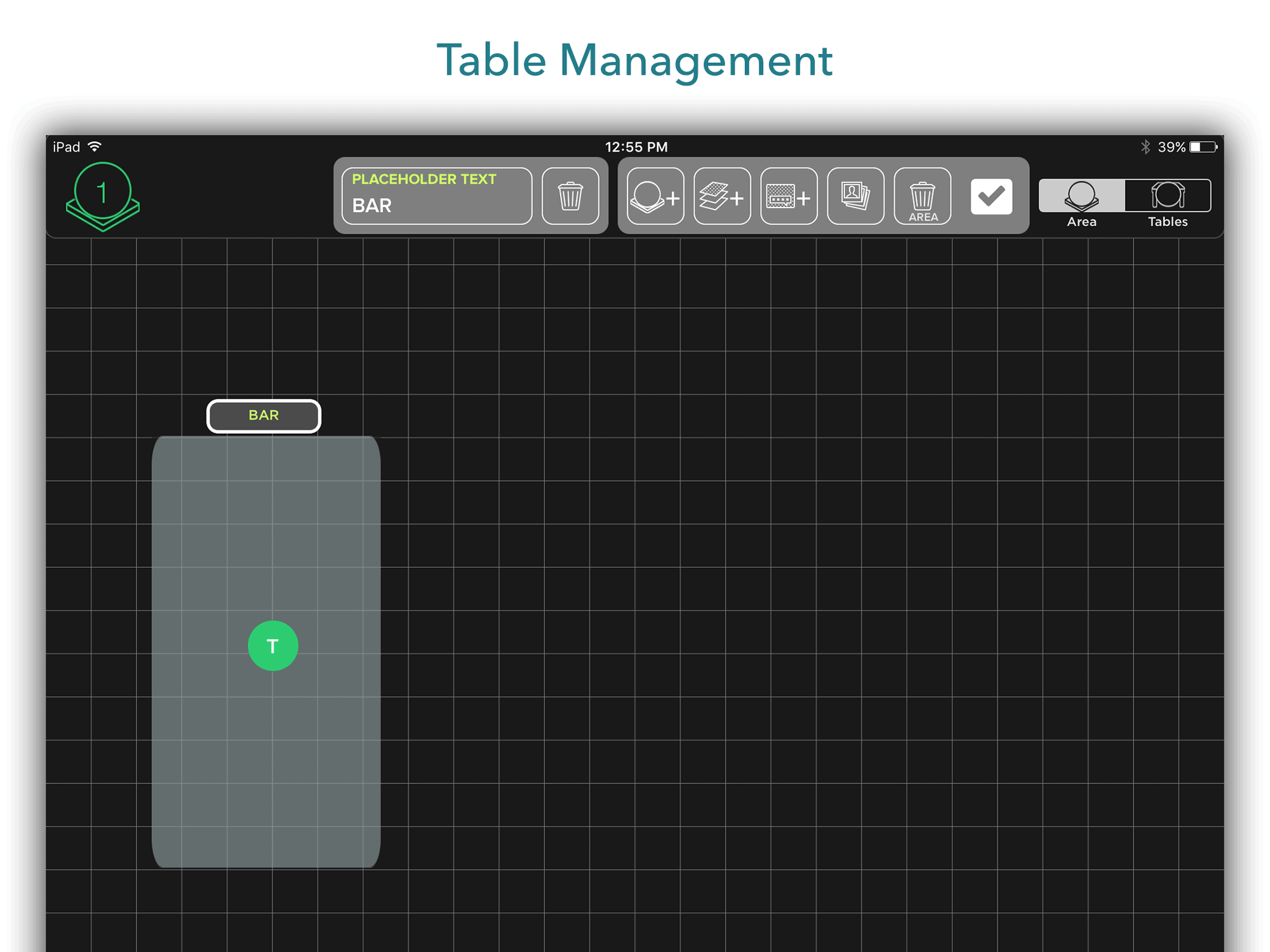
Visual Area are visual cues to mark areas in the layout, like a bar counter, kitchen, cashier area.
The tables option is pretty straightforward, just tap and select which table you want to add, and drag your table to the position as desired.
Then, after finalising your layout design, press the tick button to confirm.
You will now see the layout come alive as tables lit up in different colours. Orange colour means that the table is occupied, green is unoccupied. Perfecto, your are all set!
Now, time to get creative and make your restaurant table layout!
Ready to shift your restaurant business into greater heights?
Sign up for a FREE demo of Slurp Point of Sale today!

